
CONTRAST
What is contrast?
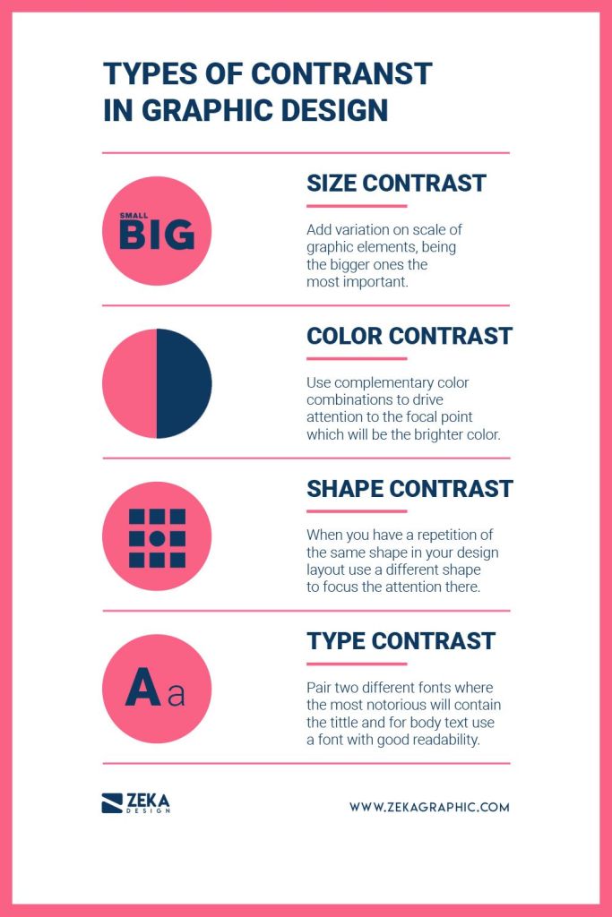
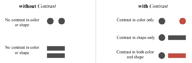
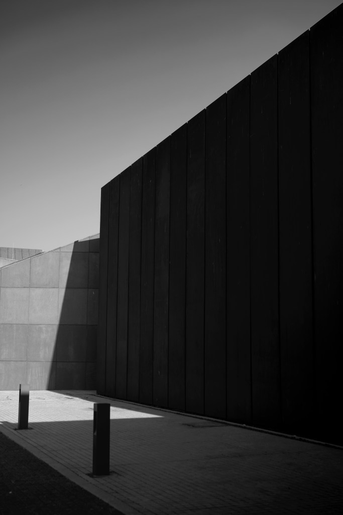
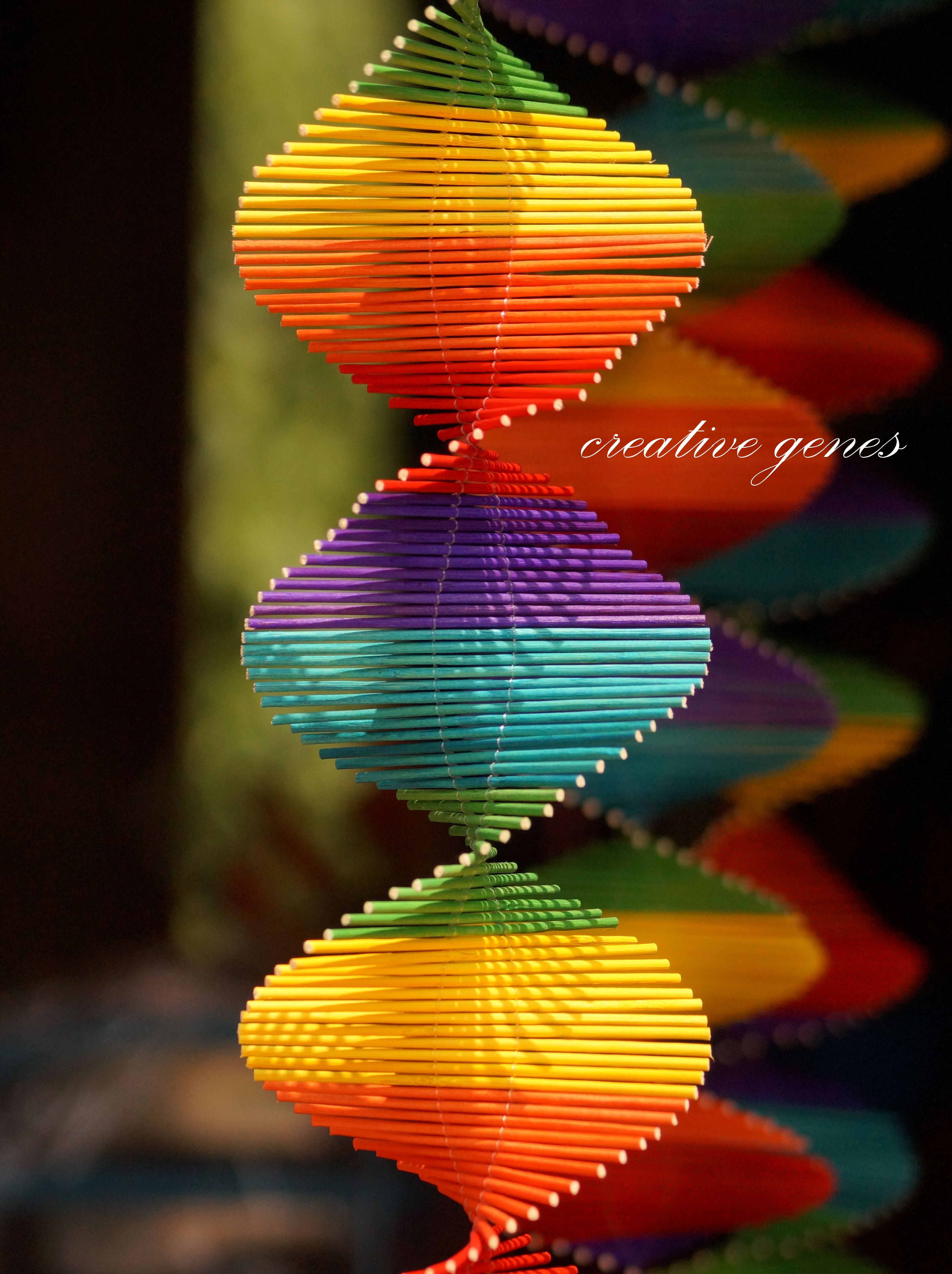
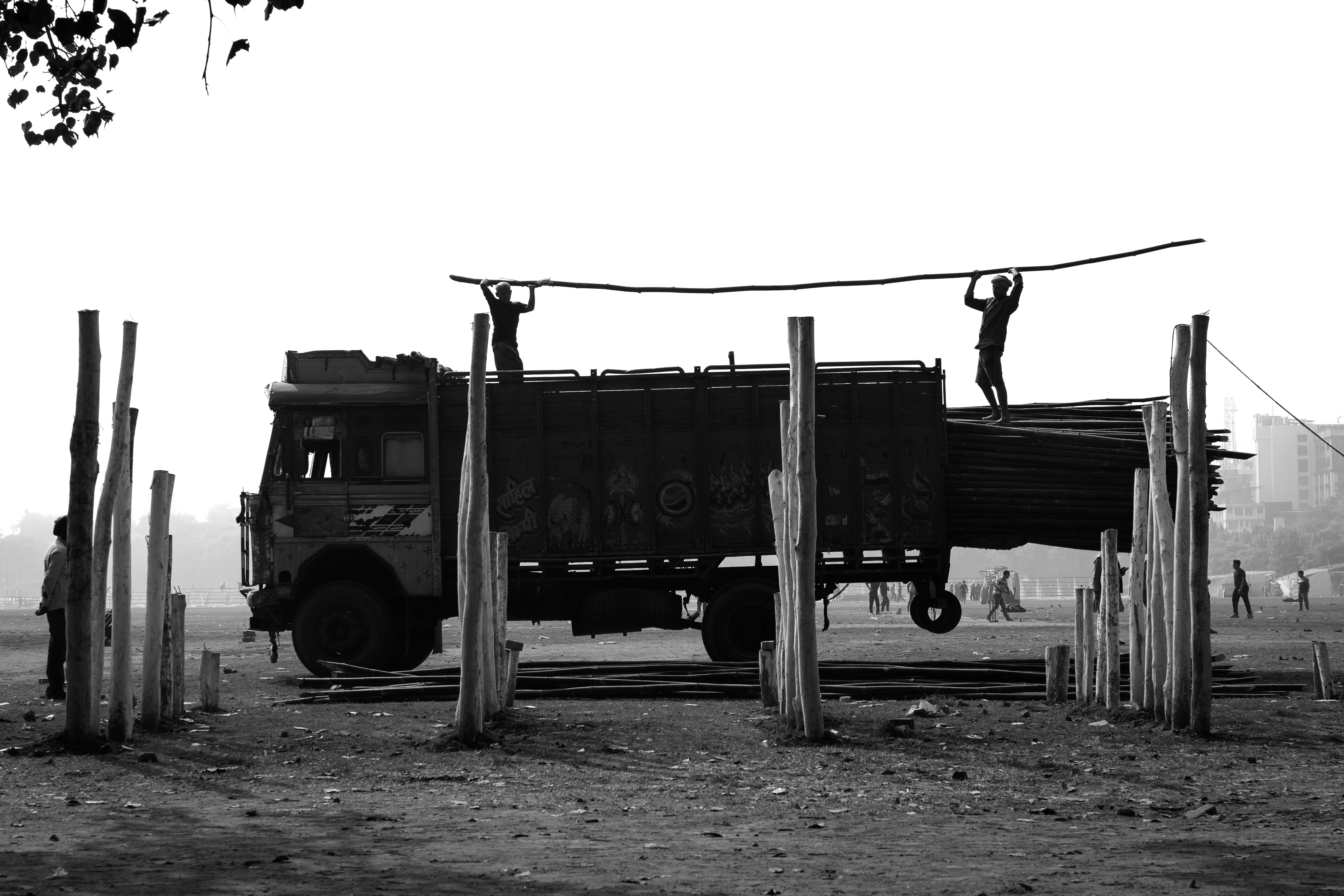
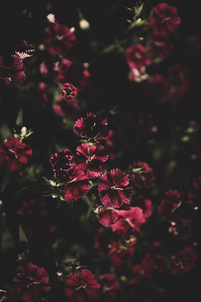
Contrast in photography refers to the use of differences in visual weight to highlight distinctions between elements. This happens when one element stands out more than another, with greater visual weight leading to stronger contrast. Essentially, creating contrast depends on variations in attributes such as shape and color.
Ever wondered why some photos just pop while others fall flat? Picture this: if every element in a photo looks the same – same size, same shape, same color – it’s like a snooze fest for your eyes! But hey, add in some contrast, and boom! Suddenly, you’ve got yourself a vibrant, exciting scene that’s just begging to be noticed.
Why Contrast is important?
- plays a crucial role in structuring your composition and setting up a hierarchy, essentially guiding viewers to the key elements of your image;
- fosters captivating connections among the visual elements within your photography compositions. It can either push elements apart, bring them together, or enhance their harmony;
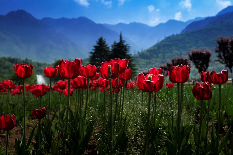
- contrasting colors, tones, size, shapes or textures can be used to make your subject stand out.
However, context is very essential for creating contrast. While we may believe that the subject of a photograph speaks for itself, its meaning is often defined by the surrounding visual elements and colors.
Further, contrast has to be well-balanced to work to your advantage. Too much of contrast in an image can be counterproductive.
Now we know that Contrast can result from uneven visual weight distribution, it’s crucial to explore how we can use visual weight to guide and control viewers’ attention towards specific areas in our photography composition.
VISUAL HIERARCHY
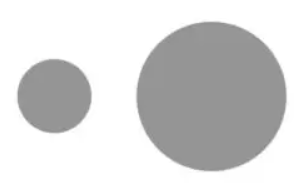
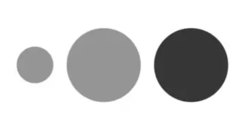
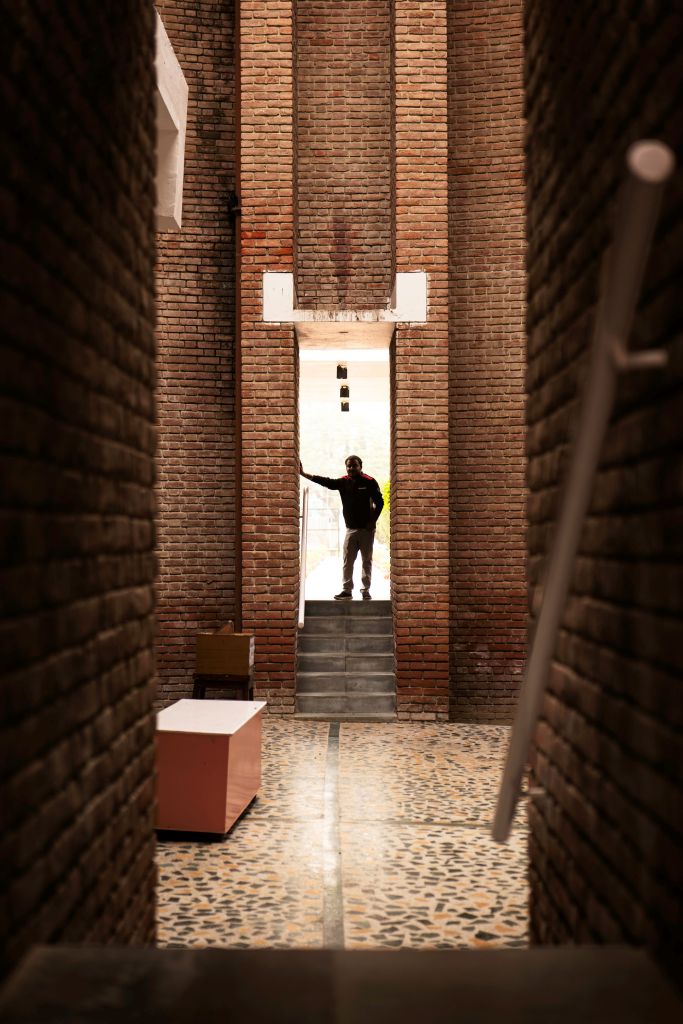
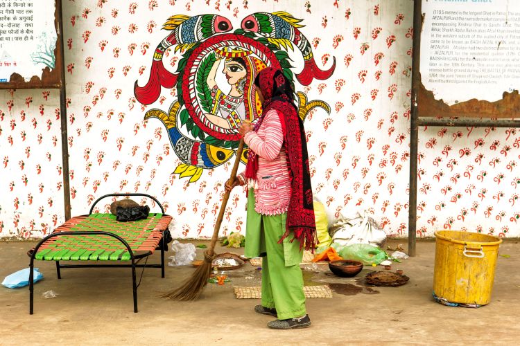
Visual hierarchy is the arrangement of elements in a photography composition based on their importance or the intended sequence that photographers expect viewers to direct their gaze toward. As elements with comparable visual weight tend to show similarity inherently, the effective utilization of visual weights plays a fundamental role in indicating visual hierarchy. Size and color represent two primary methods for establishing visual hierarchy.
Visual Weight vs. Perceptual Weight
In photography, visual weight refers to the physical attributes like size, color, and placement that dictate the prominence of elements within a composition. Perceptual weight, on the other hand, is about how viewers interpret and prioritize these elements based on their personal experiences and cultural context. While visual weight guides the composition’s structure objectively, perceptual weight adds subjective depth to the viewer’s interpretation of the photograph.
Visual Weight
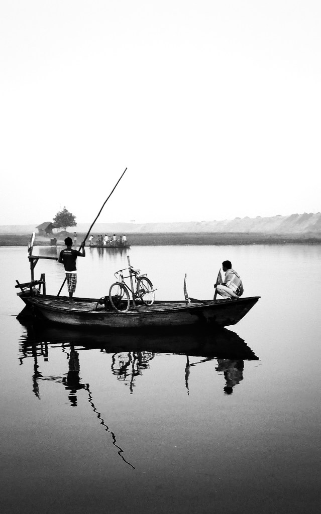
Every element in your photography composition exerts an attractive force drawing the attention of the viewer. The greater the force, the more the attention is drawn. This force is called visual weight. It is the perceived importance or dominance of elements within the frame. Achieving balance ensures that no single element overwhelms the composition, creating a sense of equilibrium and guiding the viewer’s gaze effectively. When visual weight is distributed evenly, the photograph feels well-organized and visually pleasing. Balancing elements can be achieved through strategic placement, adjusting sizes, or manipulating tones and colors. This balance enhances the viewer’s experience, allowing them to appreciate the entirety of the image without distractions or a sense of heaviness. Read more here.


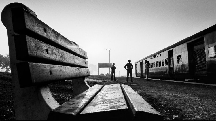
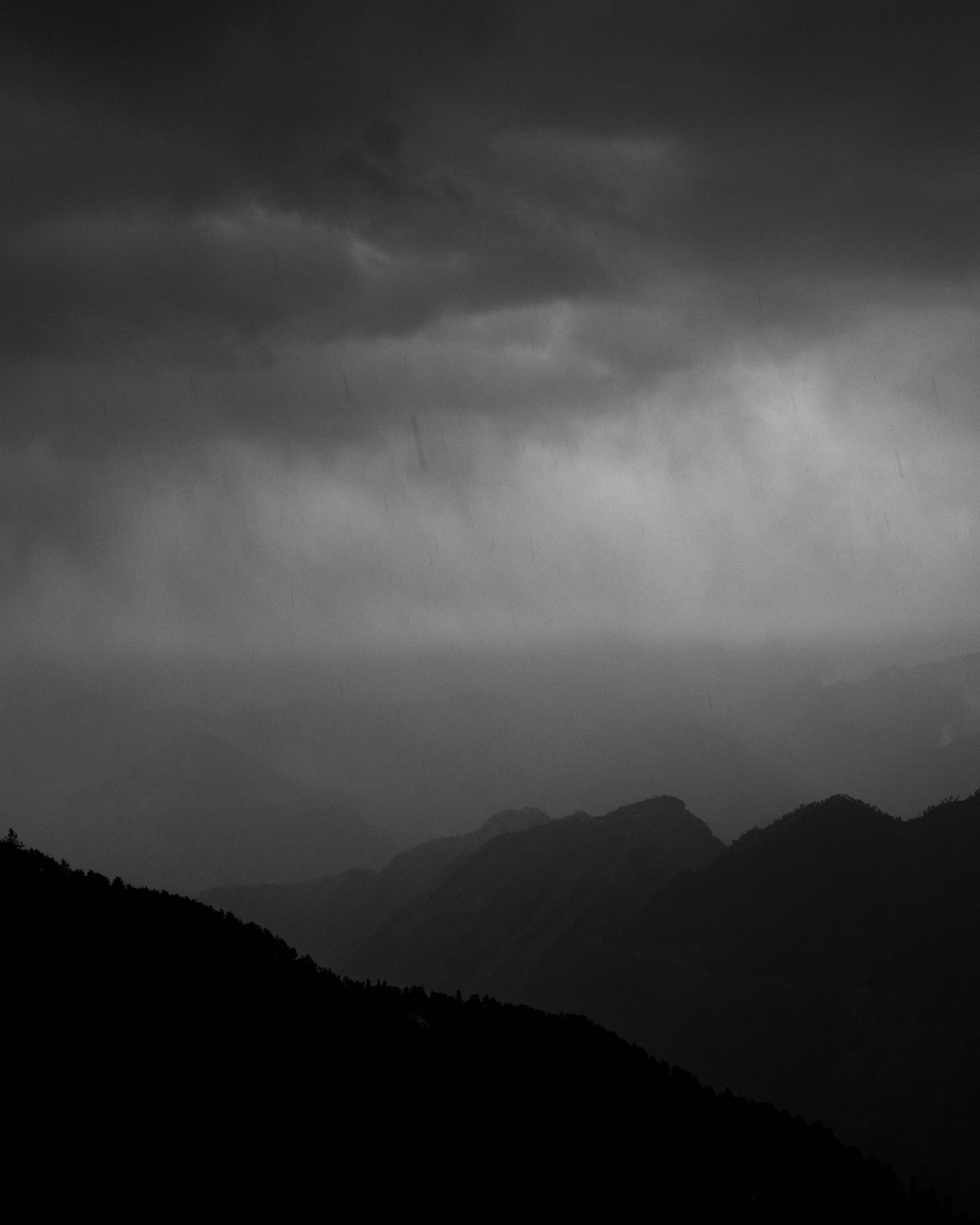
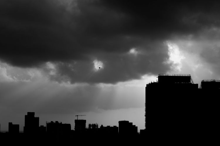
(Value simply describes the brightness or darkness of a color, with pure black and pure white representing the extremes of contrast in values)

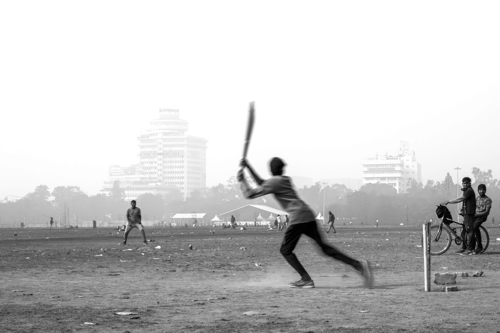
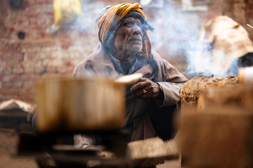
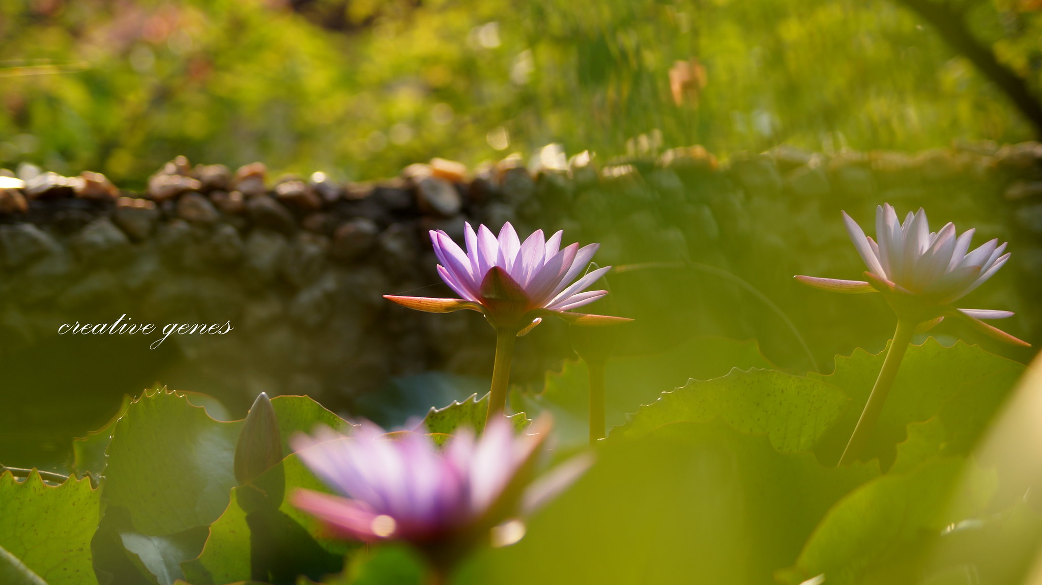
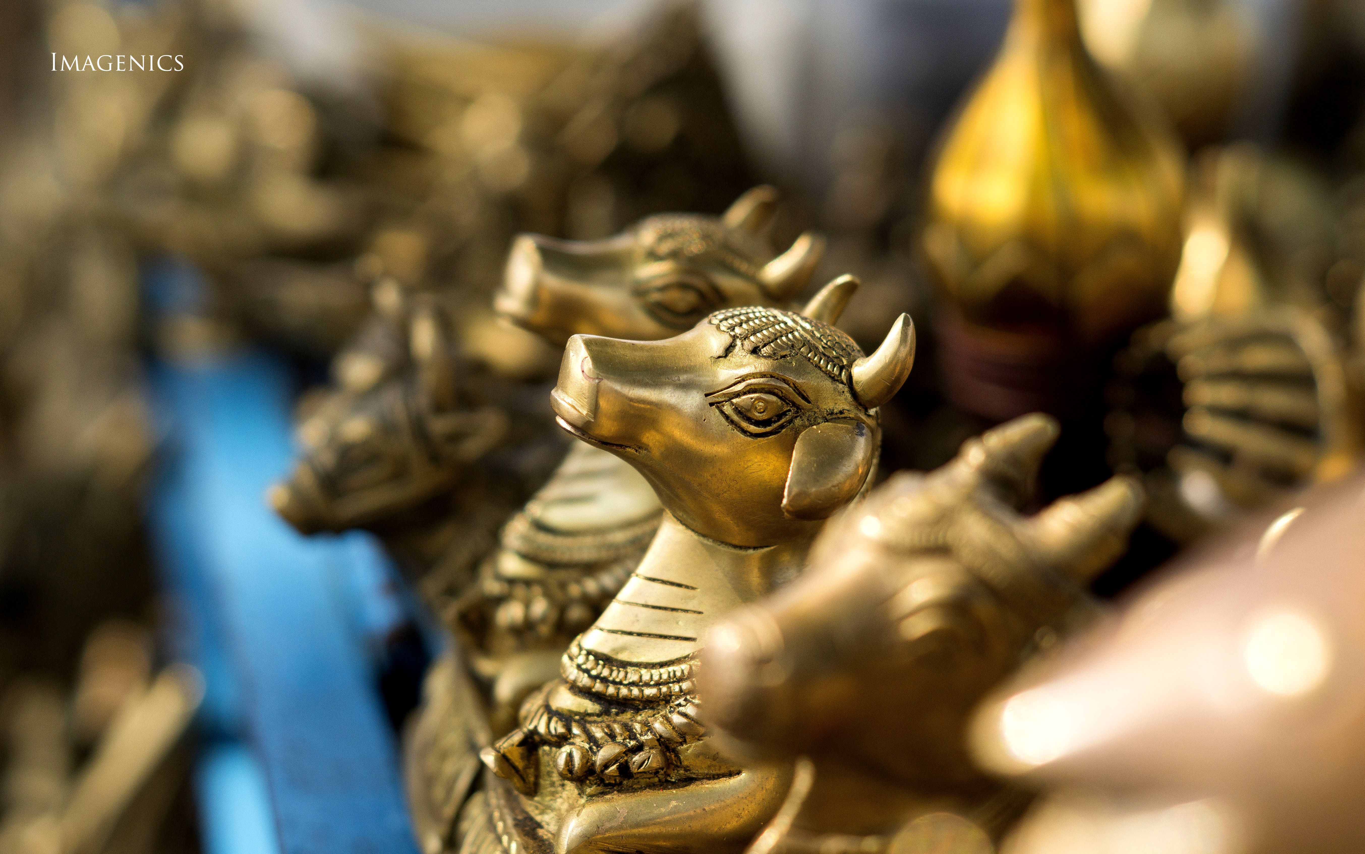
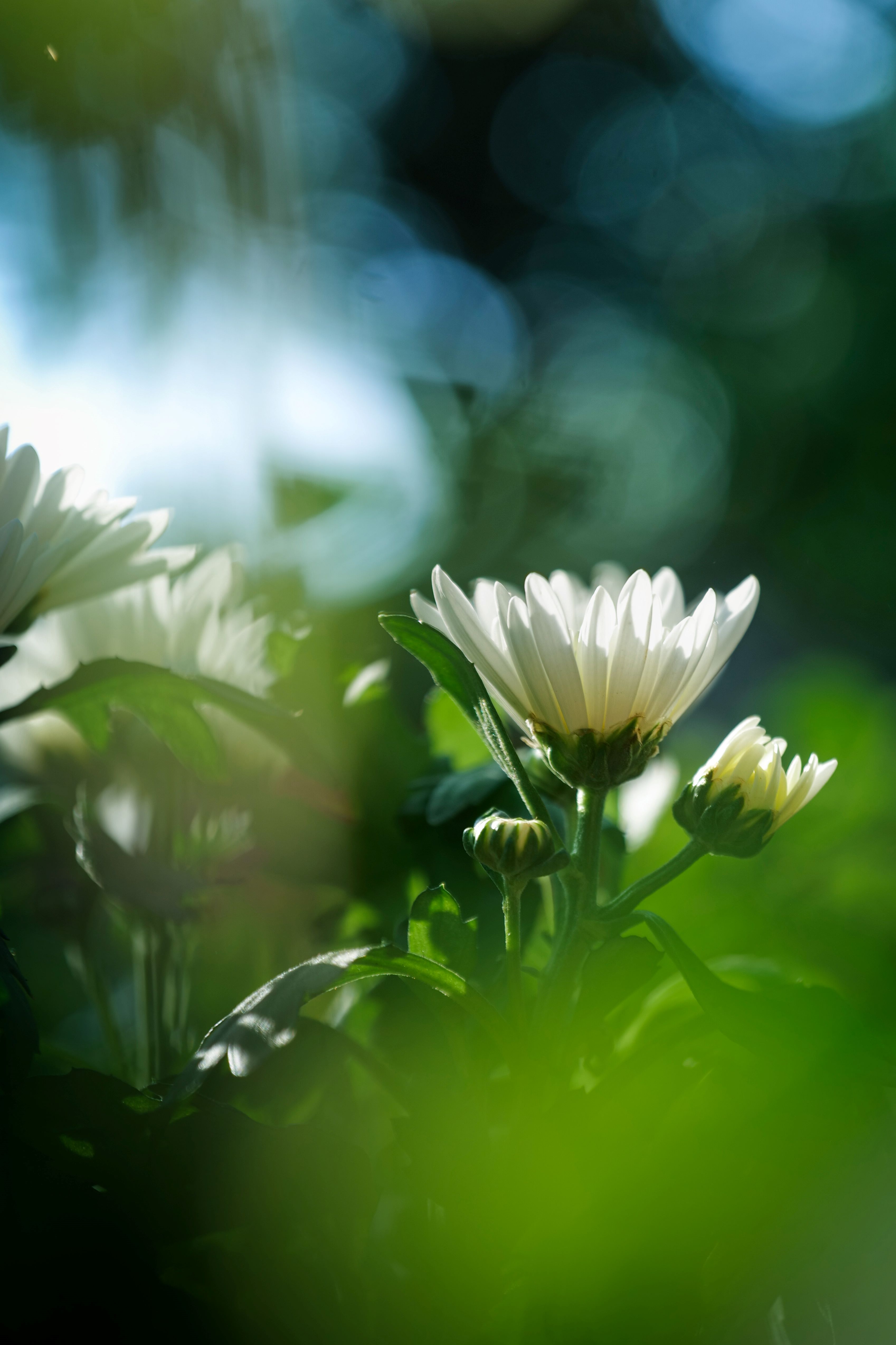
Selective Focus
By deliberately choosing which elements to keep in sharp focus and which to blur, you can direct the viewer’s attention to specific subjects, creating depth, drama, and visual interest. This technique not only enhances the overall composition but also adds a sense of dimension and narrative to the image, elevating its impact and allure.
Selective focus works by creating a shallow depth of field. While this may sound very obvious to experienced photographers, I must reiterate that selective focus (or shallow depth of field) can be achieved by any of these methods:
- By adjusting the aperture, with a wider aperture (lower F-stop number) resulting in a shallower depth of field;
- By using longer focal lengths (telephoto lenses) you can get selective focus by isolating the subject from its surroundings;
- By shooting the subject from a very close distance, the depth of field becomes shallower isolating the point of focus.


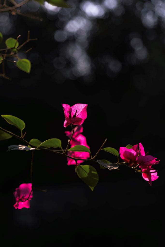
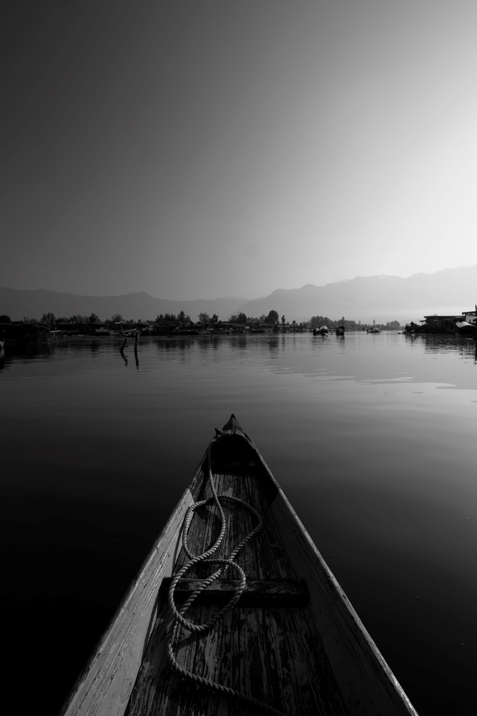
Simplicity
How to bring simplicity in your composition?
- Remove distractions, and focus on a single subject or a few key elements.
- Choose simple, uncluttered background that complements the main subject.
- Embrace negative space to give your subject breathing room and draw attention to it within the frame.
- Use shallow depth of field to blur distracting background.
- Seek out symmetry, patterns, and balanced compositions to create visual harmony and a sense of orderliness.
- Consider soft, diffused lighting to minimize harsh shadows and create a gentle, even illumination.
A clean, uncluttered composition can often be more visually appealing than a very busy composition with too much happening. When you just focus on the essential elements in the frame, you allow the main subject to stand out prominently. Minimalistic compositions help viewers focus their attention on the key elements of the scene, enhancing clarity and impact. Additionally, simplicity often evokes a sense of elegance and sophistication, elevating the overall aesthetic appeal of the photograph.

Post-Processing
Useful Resources
– Lightroom vs. Photoshop: When to Use Each
– HSL/Color Panel in Lightroom
– Color Grading Tool in Lightroom
– 9 Easy Lightroom Tips
– How to Use Dehaze Tool in Adobe LR and PS
– Using the ‘Levels’ Tool in Photoshop
– Using the ‘Curves’ Tool in Photoshop
– 3 Ways To Get Glowing Skin on Photoshop
– Adobe Lightroom Tutorial – Professional
– Frequency Separation for Skin Retouching
– Professional Retouching by Dennis Dunbar
– Mastering Color Grading Panel in Lightroom
– Overview: Digital Photo Editing Workflow
– Understanding Exposure Using Histogram
– Understanding Histograms: Tones & Contrast
– Understanding Histograms: Luminosity & Color
– Saturation vs. Vibrance
– Colour Saturation
– Guide to Image Sharpening
Consider editing as a pinch of salt in your food. Less will be tasteless, more will be horrible. While I am sure, you must be already familiar with various editing techniques, I will share a few editing techniques that I use most frequently.
- Develop a consistent and tasteful style of post-processing.
- Use ‘Vibrance’ tool, instead of ‘Saturation’ to adjust colors.
- Go for selective editing, instead of global editing, by using techniques like masking, dodging and burning, as much as you can.
- Use ‘Linear Gradient’ tool for each corner of the frame to create vignetting effect, not the usual post-crop vignetting slider.
- Use negative clarity for the unimportant parts to bring attention to the main subject.
- Play with ‘Curve’ tool to create contrast, instead of using ‘Contrast’ slider.
- Play with ‘Luminance’ slider to increase or decrease relative importance of the colors in the image.


Discover more from Vivek Verma
Subscribe to get the latest posts sent to your email.
