
Embark on a captivating journey through the aesthetics of photography in this three-part blog series. In Part 1, we explore the foundational elements of visual art including color. Part 2 delves into interplay of light and shadows, composition and perspective. The final installment, Part 3, navigates contrast, simplicity, selective focus, negative space, and the transformative impact of post-processing. Join us as we unravel the threads that create stunning visual narratives in each frame, uncovering the secrets behind captivating photographs.
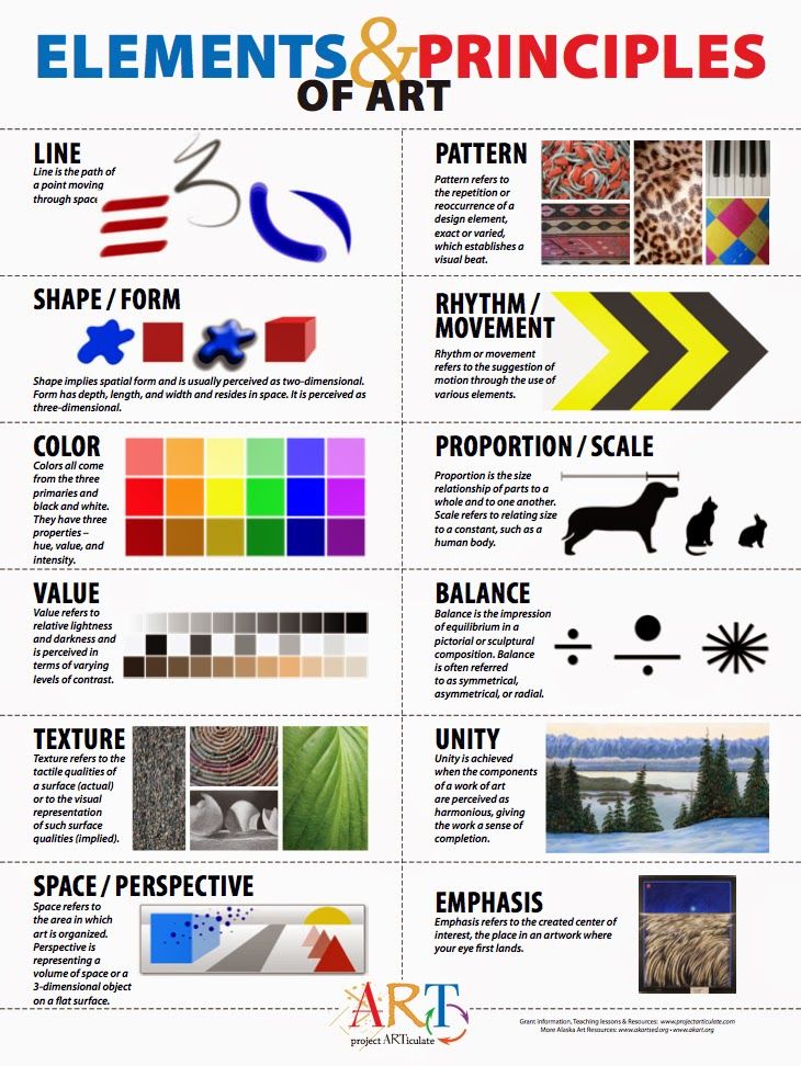
Elements of Visual Art
There are seven elements of visual art:
- LINES
- SHAPES
- FORM
- SPACE
- TONE/ VALUE
- TEXTURE
- COLOR
When you include these elements in your composition, your photograph is bound to shine.
SPACE
Space. In photography composition, space is the perceived distance and arrangement of elements within the frame. Creative space management guides the viewer’s gaze, establishes scale, and conveys a narrative. Deliberate use of negative space draws attention, evokes simplicity, or creates contemplative moods, while effective use of positive space fosters dynamic and visually rich compositions. When you allow for negative space in your composition, the empty space can provide a sense of balance, calmness, and emphasis on the main subject. Know more here.

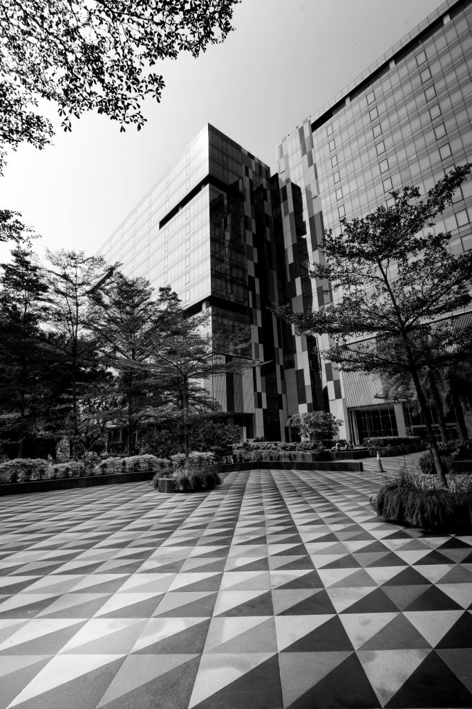
Symmetry
Utilizing symmetry effectively involves arranging elements in a way that mirrors each other on either side of an axis, creating balance, order, and visual harmony. By leveraging symmetry, you can draw the viewer’s attention directly to the subject, evoke a feeling of stability, and create a strong focal point. Additionally, breaking symmetry subtly or incorporating slight variations can add a touch of intrigue and prevent the image from appearing too static.

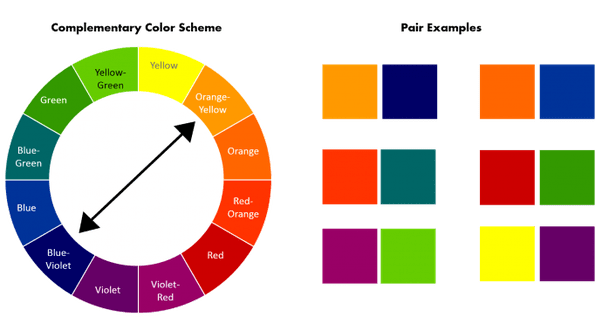
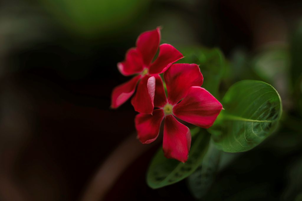
In commercial photography, the combination of blue and orange is frequently used as complementary colors. This pairing creates a dynamic and visually striking contrast, making products or subjects stand out. In street photography, red and green are popular complementary color choices.
Watch out this space for Part 2 and 3 of this series of blog posts where I cover interplay of light and shadows, composition and perspective, contrast, simplicity, selective focus, negative space and post-processing.
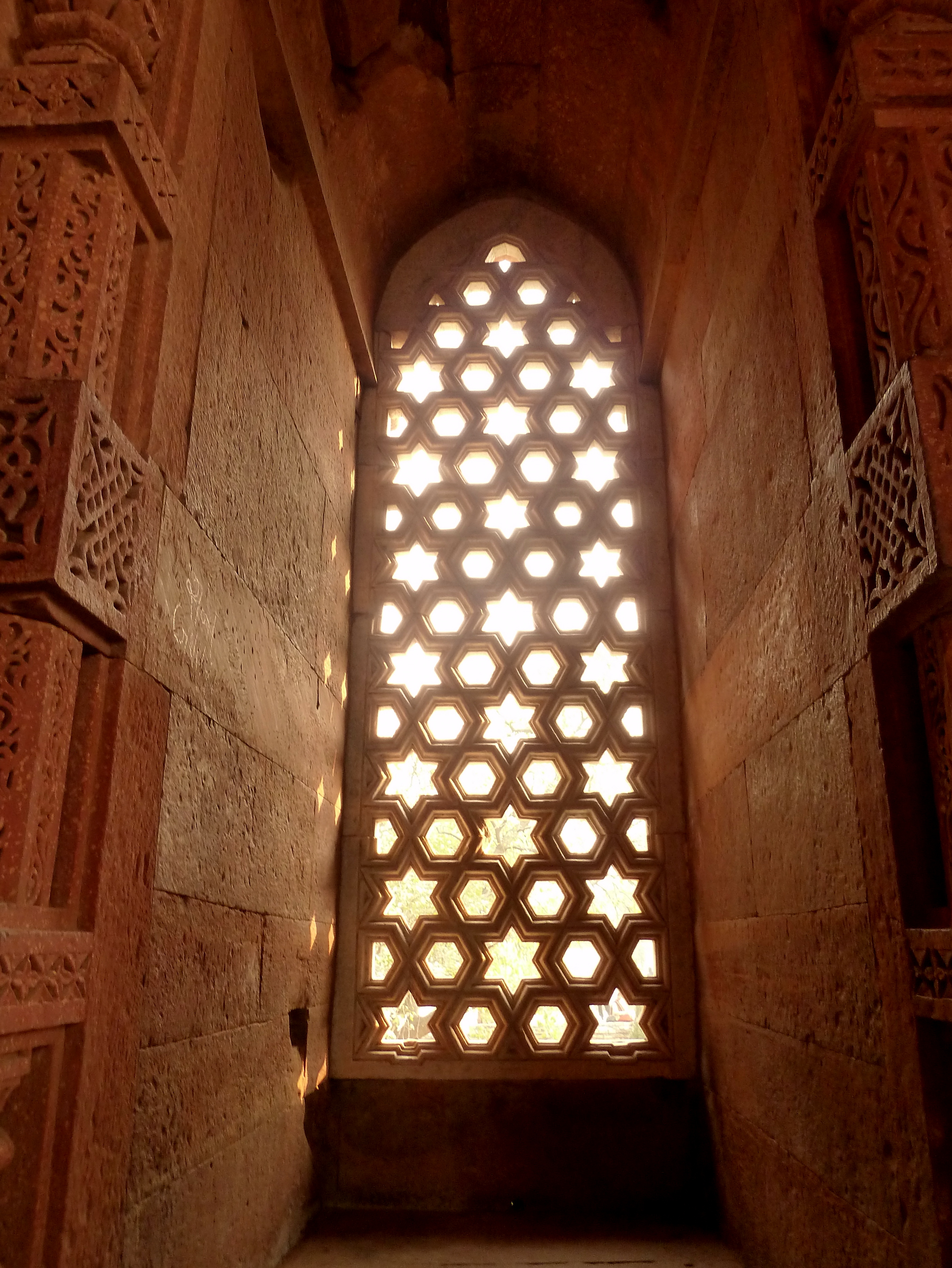
LINES
Lines help you guide the viewer’s gaze and create a sense of structure within the frame. Diagonal lines can add dynamism and energy, leading the viewer’s eye through the photo, while horizontal lines often evoke a sense of calm and stability. Vertical lines can convey strength and height. Additionally, converging and leading lines can create depth and draw attention to a focal point. Know more here.


SHAPES
Creatively using shapes in photography establishes order, balance, and harmony in your frames. Circles symbolize unity, while sharp triangles convey tension and excitement. Rectangles suggest reliability, and squares evoke security. Geometric or organic, shapes guide perception and add structure. Silhouettes, a powerful example, highlight a subject’s essential shape against light, creating mystery and abstraction. Whether through patterns, contrasting forms, or intentional framing, thoughtful shape use allows photographers to craft visually impactful images. Know more here.


FORM
Forms, representing three-dimensional objects and their volumes, are integral to photography composition as they add depth, dimension, and a tangible sense of reality to images. By skillfully utilizing forms, you can transform a flat, two-dimensional photograph into a visually dynamic and immersive experience. Whether highlighting the sculpted details of a portrait, the curves of architecture, or the undulating shapes in nature, understanding and creatively manipulating forms contributes to the overall aesthetic appeal of a photograph. Know more here.

Tones/ Values
In photography, values are the varying shades of light and dark, creating a grayscale from black to white. Controlling tones is crucial for adding depth and mood to a photo. Balancing dark shadows and bright highlights makes the picture lively. Playing with these elements lets you create a visual hierarchy, emphasizing and subduing elements to influence the image’s overall atmosphere. Know more here.


TEXTURE
Texture in a photo is how surfaces look and feel, such as the roughness of a rock or the softness of a pet’s fur. Capturing light and shadow accentuates these textures, engaging the viewer with a tactile quality. Using texture adds a sensory dimension to the photo, making viewers feel connected. You can play with texture to emphasize elements, like highlighting wrinkles on a face or the crispness of autumn leaves. Know more here.


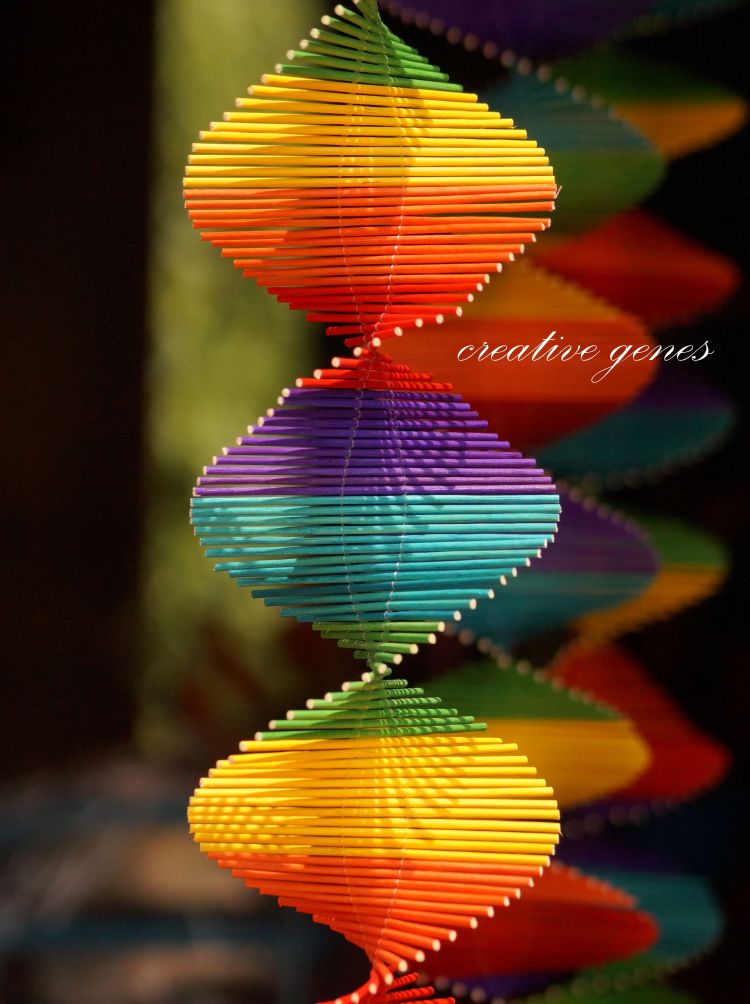
COLOR
Color Harmony
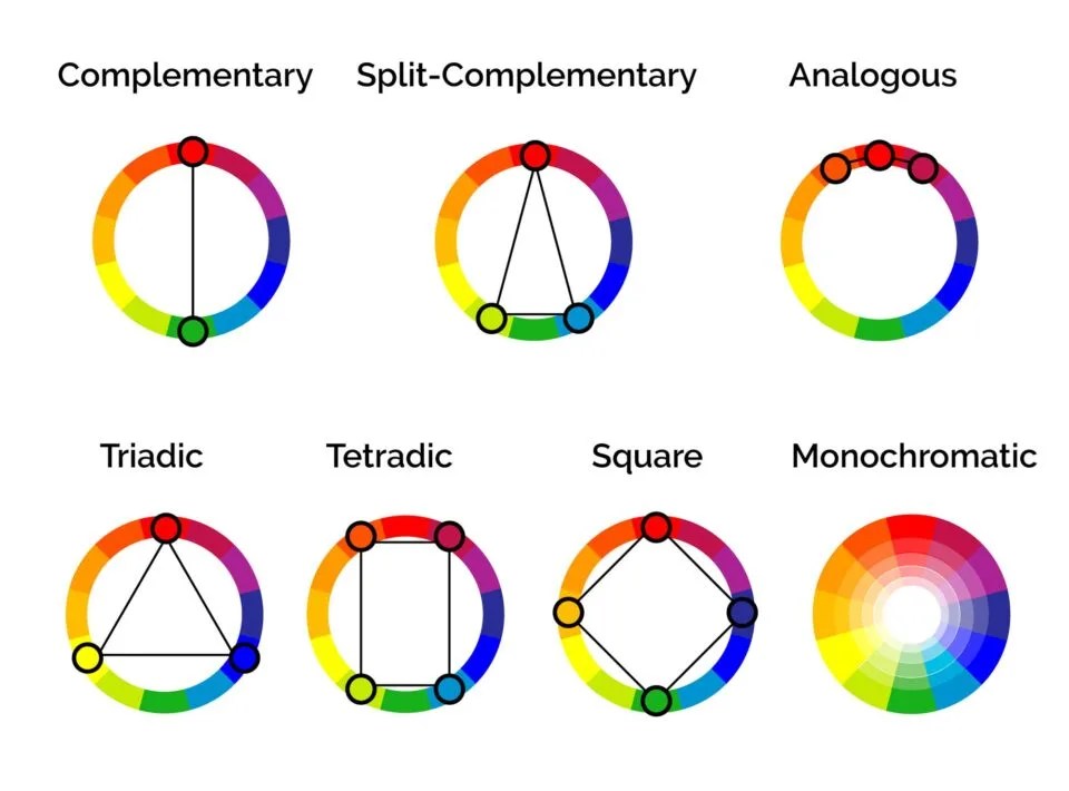
Color harmony is essentially a visually pleasing and balanced arrangement of colors within an image. Harmonious color schemes contribute to a sense of coherence, unity, and balance. Complementary colors, positioned opposite each other on the color wheel (e.g., red and green), create dynamic contrast and vibrancy when used together. Whether through analogous colors for a serene and cohesive look or complementary colors for dynamic contrast, mastering color harmony allows you to infuse your work with creativity and convey specific moods.

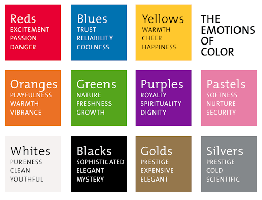
Color Psychology
Colors possess the ability to evoke specific emotions; for instance, warm colors like red and orange can convey passion and energy, while cool colors like blue and green evoke calmness. You can leverage color theory to enhance the emotional impact of the images, guiding viewers to interpret and feel certain moods. Including colors in your composition involves not only choosing a palette but also understanding the cultural and psychological associations attached to different colors.
Further Reading:


Read more about the elements of visual art in my earlier blog posts.

Discover more from Vivek Verma
Subscribe to get the latest posts sent to your email.

One thought on “Aesthetics of a Photograph – Elements of Visual Art (Part 1)”